Portfolio Dashboard - Every Site at a Glance
The Portfolio is the operator view across every site you have enrolled via Managed Sites. Leads, CTA clicks, traffic sources, and a visitor map for each site. Built for running ten or a hundred sites, not just one.
Every number on the page shows the change versus the prior period (last 30 days vs. the 30 before, by default). The Portfolio is where you spot the site that started losing leads last week, before the customer calls to complain.
Subscription required. The Portfolio aggregates leads and CTA clicks from sites enrolled via Managed Sites. PAYG / Free projects (set up via Set up lead capture) send form submissions by email only - they do not appear here, and no clicks are tracked for them. Enrol the site to bring it into the Portfolio.
If you cancel, the Portfolio goes dark at the end of the billing period (sites are auto-archived, form submissions still send emails, no new data is captured). Historical rows are still exportable from the Leads Inbox for 30 days. Re-subscribe and pick which sites to re-enrol - see the cancellation FAQ for the full flow.
1The Operator View
Open Portfolio from the sidebar. The page is split into four bands: the KPI strip up top, a date-range selector, the per-site table, and three side panels (Top Pages, Top Cities, Top Sources).
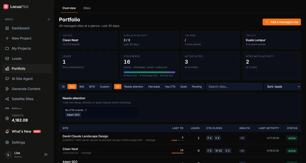
Everything on the page respects the date range chip you pick. Change it once, the whole page updates. No per-widget filters to keep in sync.
2The KPI Strip
Five numbers across the top. Each has an arrow showing change vs. the prior period of equal length.
- 1Leads - form submissions across every enrolled site. Spam is excluded.
- 2CTA clicks - phone taps, WhatsApp clicks, email clicks, and outbound link clicks combined.
- 3Spam - submissions flagged as honeypot hits or filtered out for other reasons. Useful for spotting forms under attack.
- 4Sites - count of Active enrolled sites. Pending and Archived do not count.
- 5Events (7-day) - total tracked events in the last 7 days, regardless of the page range. A quick liveness check: zero here means the tracker is not firing.
About the arrows: a green up-arrow means more than the prior period of the same length. If you pick the last 30 days, the comparison is the 30 days before that. The arrow is not vs. last year or vs. a moving average.
3Date Ranges
Four chips sit at the top of the dashboard: 7 days, 30 days, 90 days, and Custom. Pick one and every number on the page (KPI strip, per-site table, and all three side panels) re-runs for that window.
Custom range lets you pick any pair of dates. Useful for matching a campaign window, a Google Ads burst, or a specific month.
4The Per-Site Table
One row per enrolled site. Columns are kept tight on purpose so a 30-site portfolio still fits on a laptop screen.
Columns
- •Site - the hostname. Click it to open the live site in a new tab. Click the small "Details" link to drill into the per-site detail page.
- •Health - green dot for Active, amber for Pending, grey for Archived.
- •Leads - count in the selected range, with the delta arrow.
- •CTA clicks - same idea, for clicks.
- •Channel mix - one chip per dominant traffic source. Quick read of where each site's visitors are coming from.
You can search and sort by clicking any column header. The search filters by hostname; partial matches work.
5Three Side Panels
Below the table are three panels rolled up across the whole portfolio:
Top Pages
The 25 page slugs with the most leads-plus-clicks across every enrolled site. Spot which page templates convert and which do not.
Top Cities
The 10 cities sending the most events to your portfolio. Useful for spotting unexpected geo-expansion or off-target traffic.
Top Sources
The 10 channel-and-referrer combinations driving the most volume. Organic Google, paid Google, Facebook ads, and direct typing each show as separate rows.
6Drill Into One Site
Click any site in the table to open its detail view. The same layout repeats but scoped to that one site.
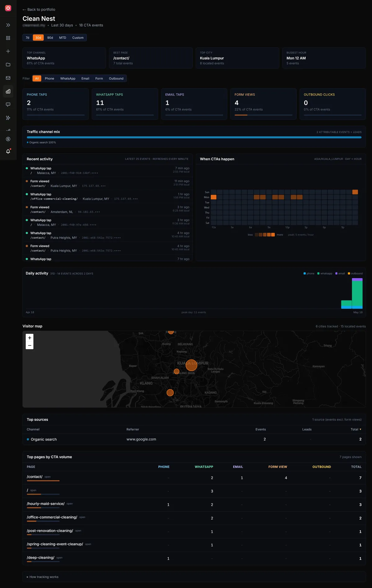
CTA breakdown cards
One card per event type: phone, WhatsApp, email, outbound. Each shows total count and delta. Quick read of which CTA is doing the work.
Channel mix bar
A stacked bar across the full traffic-source breakdown. Organic, paid, social, referral, direct, email in one glance.
Visitor map
A Leaflet map with one dot per city of origin. Dot size scales with event count. Capped at 100 cities; the long tail rolls up into one bucket.
Top sources table
Sortable list of every (channel, referrer) pair that sent at least one event to this site in the range. Click a column to sort.
7What the Portfolio Is Not
Quick set-expectation list so you can decide where the Portfolio fits in your stack:
- ✕Not a Google Analytics replacement. No page-view counts, no bounce rate, no session duration, no funnel builder. The Portfolio measures lead-shaped events, not browsing behaviour.
- ✕No event-level CSV export today. You see aggregates and the Leads Inbox. Raw event export is on the roadmap.
- ✕No GSC or GA pull-through. Search Console and Analytics integrations ship in Release 2.
- ✕Not multi-user yet. Today only the project owner sees the Portfolio. Team access is on the roadmap behind Agency tier.
The Portfolio is sized for at-a-glance health checks across many sites at once. If you want deep behavioural analytics on one site, keep GA4 installed. The two are complementary.
Related Guides
Open Your Portfolio
Subscribe to Operator or above and the Portfolio unlocks for every site you have enrolled.
Open Portfolio